Fieldfare Communications
Brand identity design for an independent internal communications consultant.
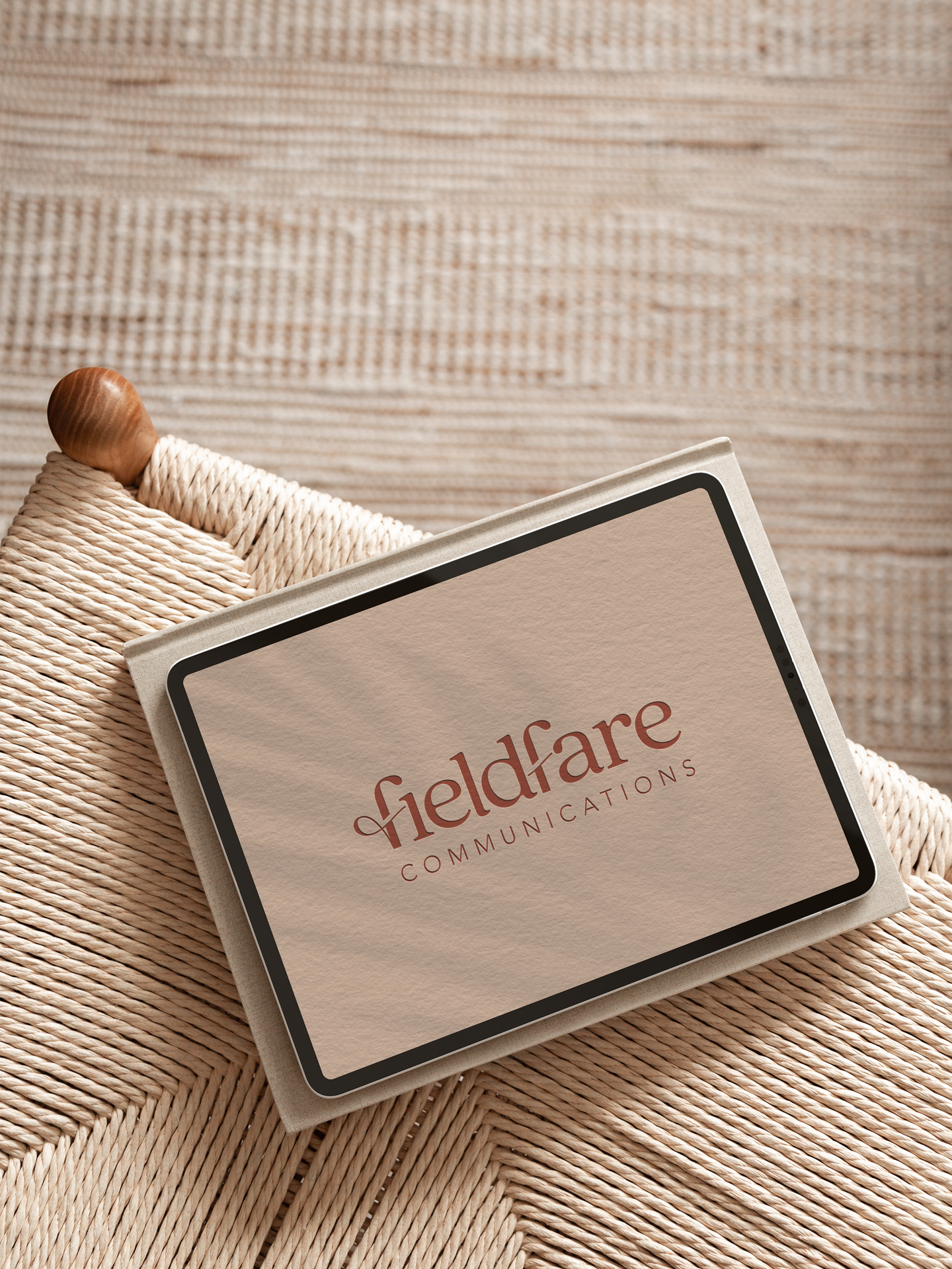
When Emma decided to go out on her own, Fieldfare Communications was still an idea getting ready to become a business. Our paths had crossed a few years earlier, so Type & Thread was her first port of call for the brand.
The brief wasn't simply a logo. We had to work out what Fieldfare should look and feel like before there was anything visual to work with.
Starting with the thinking
We kicked off with a strategy session and a lot of questions: the business Emma wanted to build, who she wanted to work with, and how she wanted clients to feel. That gave us the foundations of the brand, including three core values: fairness, integrity and clarity.
From there we developed two creative directions. Emma chose soft serif typography, natural photography and an earthy palette with warm terracotta at its heart. It feels approachable and human, but still credible in front of her corporate audience of leaders and organisations.
Built around the fieldfare
The name comes from the fieldfare bird, inspired by Emma's love of nature and birdwatching. Rather than draw a literal bird, we looked for quieter ways to carry the story through.
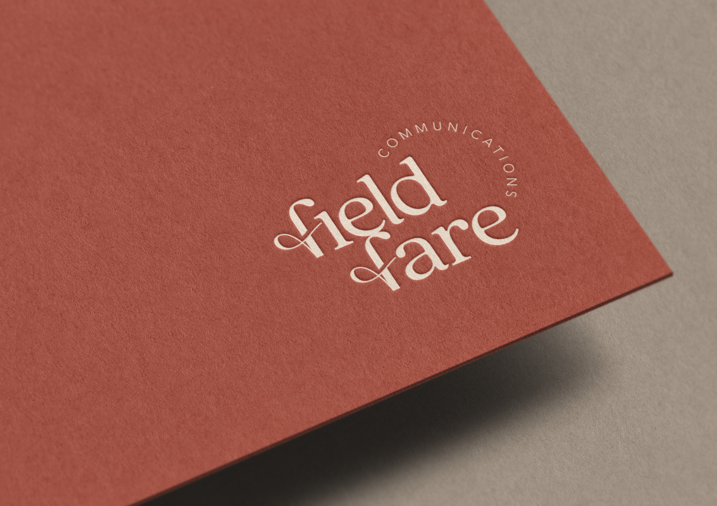
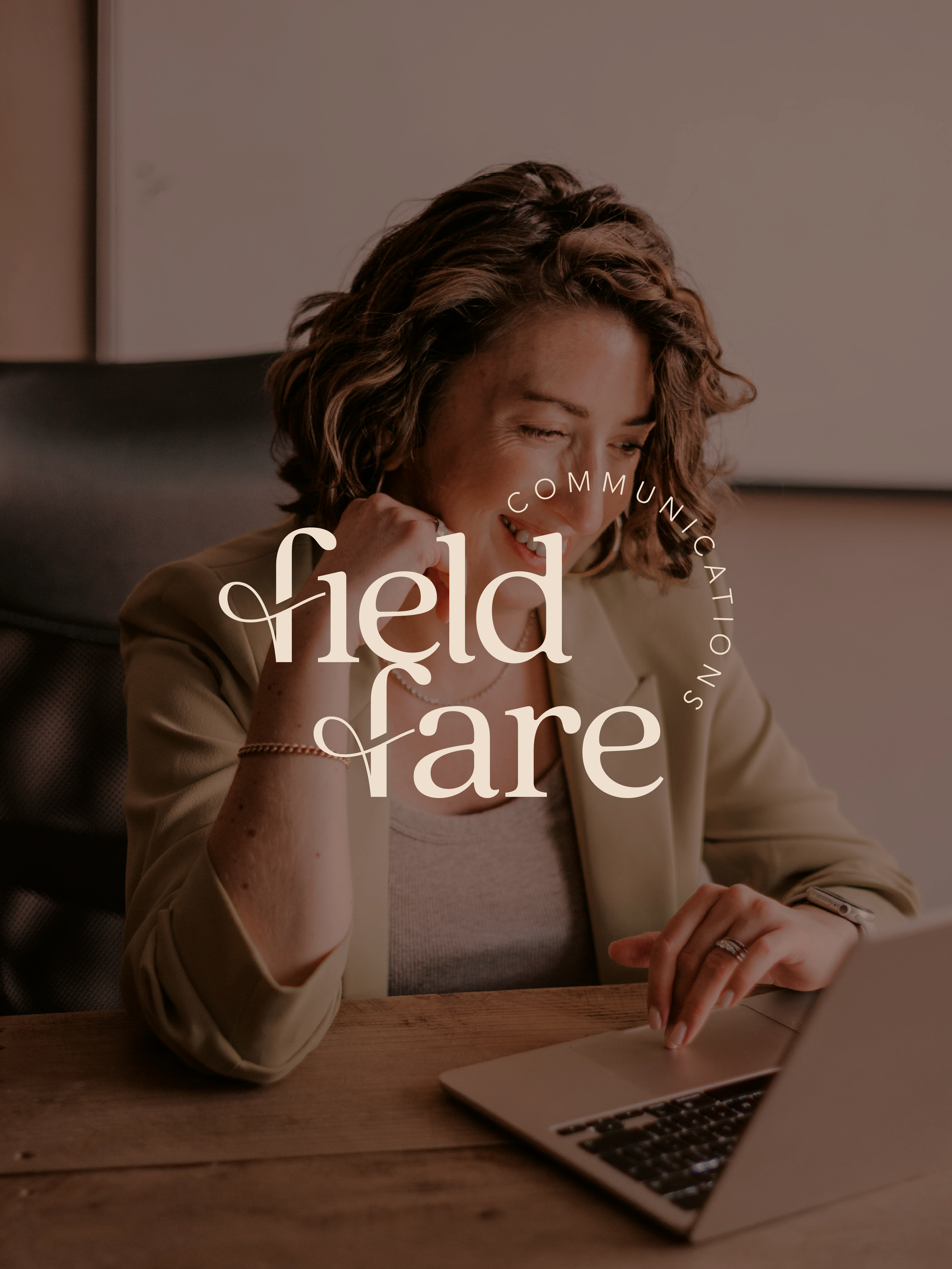
The wordmark pairs a soft, rounded serif with a simple sans for ‘Communications’. The detail we love is the customised letter ‘f’. A fluid line through the letterform references the fieldfare's flight, and the stroke cutting through it is a nod to Emma's knack for cutting through corporate noise and making complicated communications easier to understand.
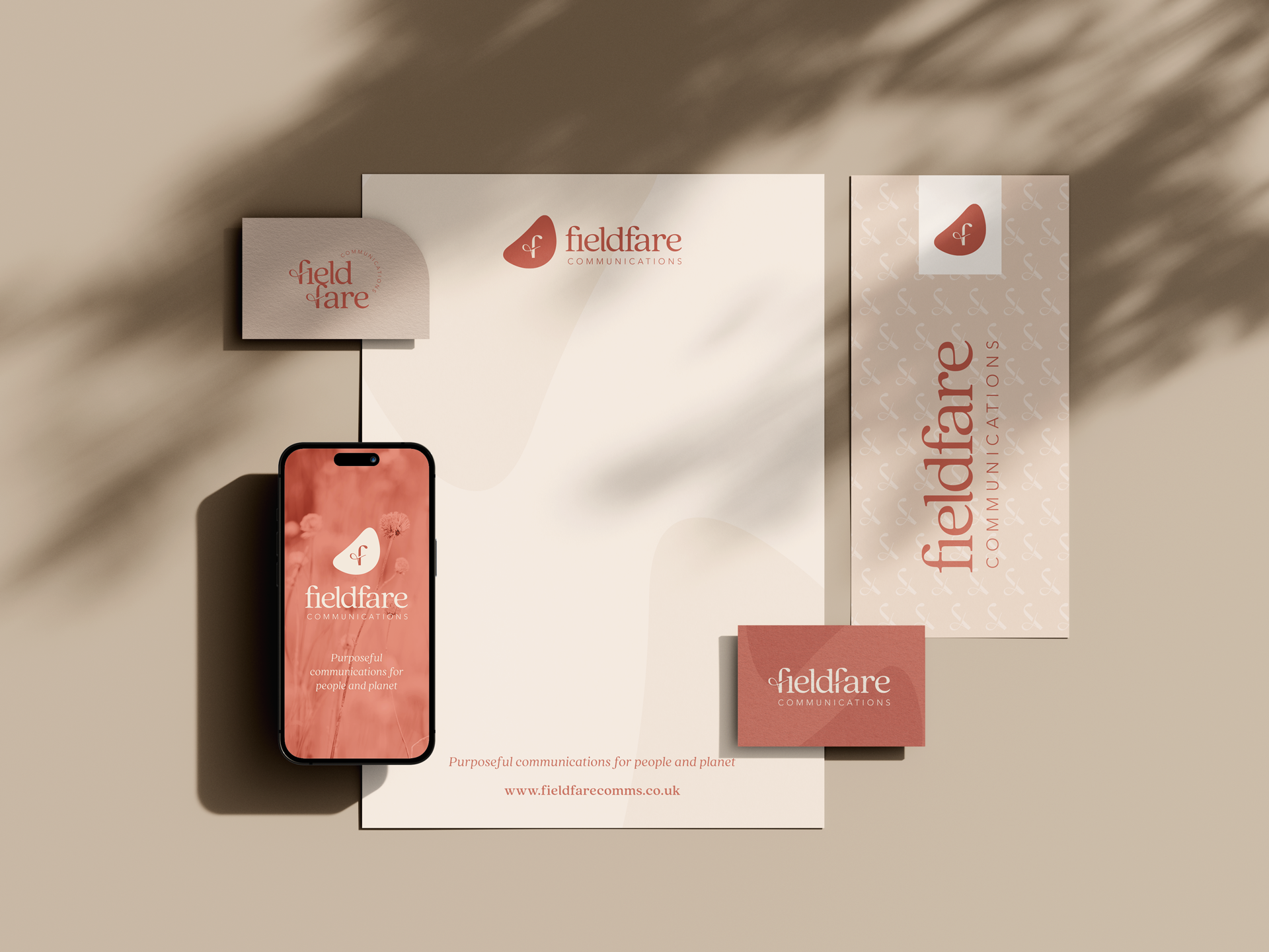
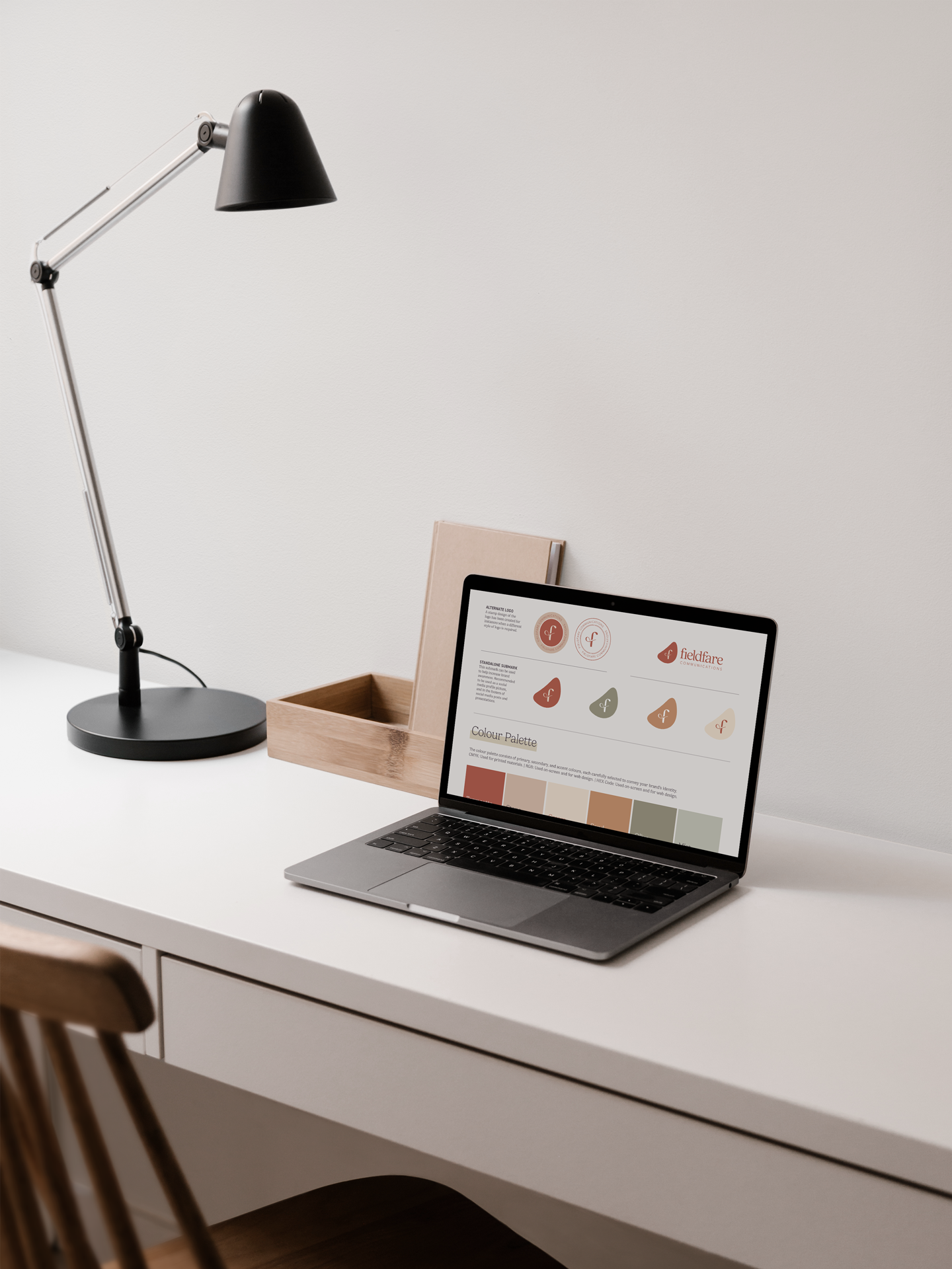
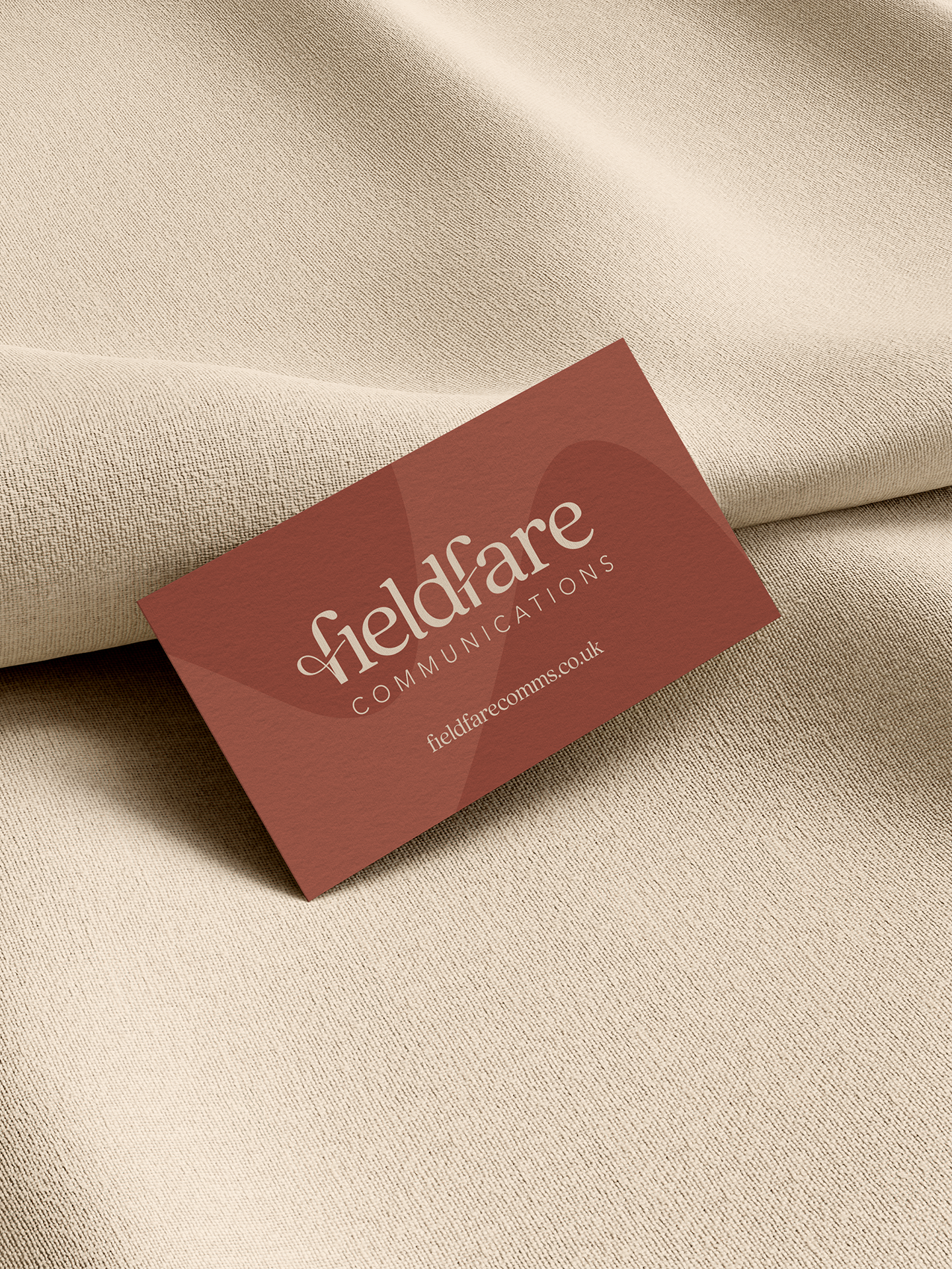
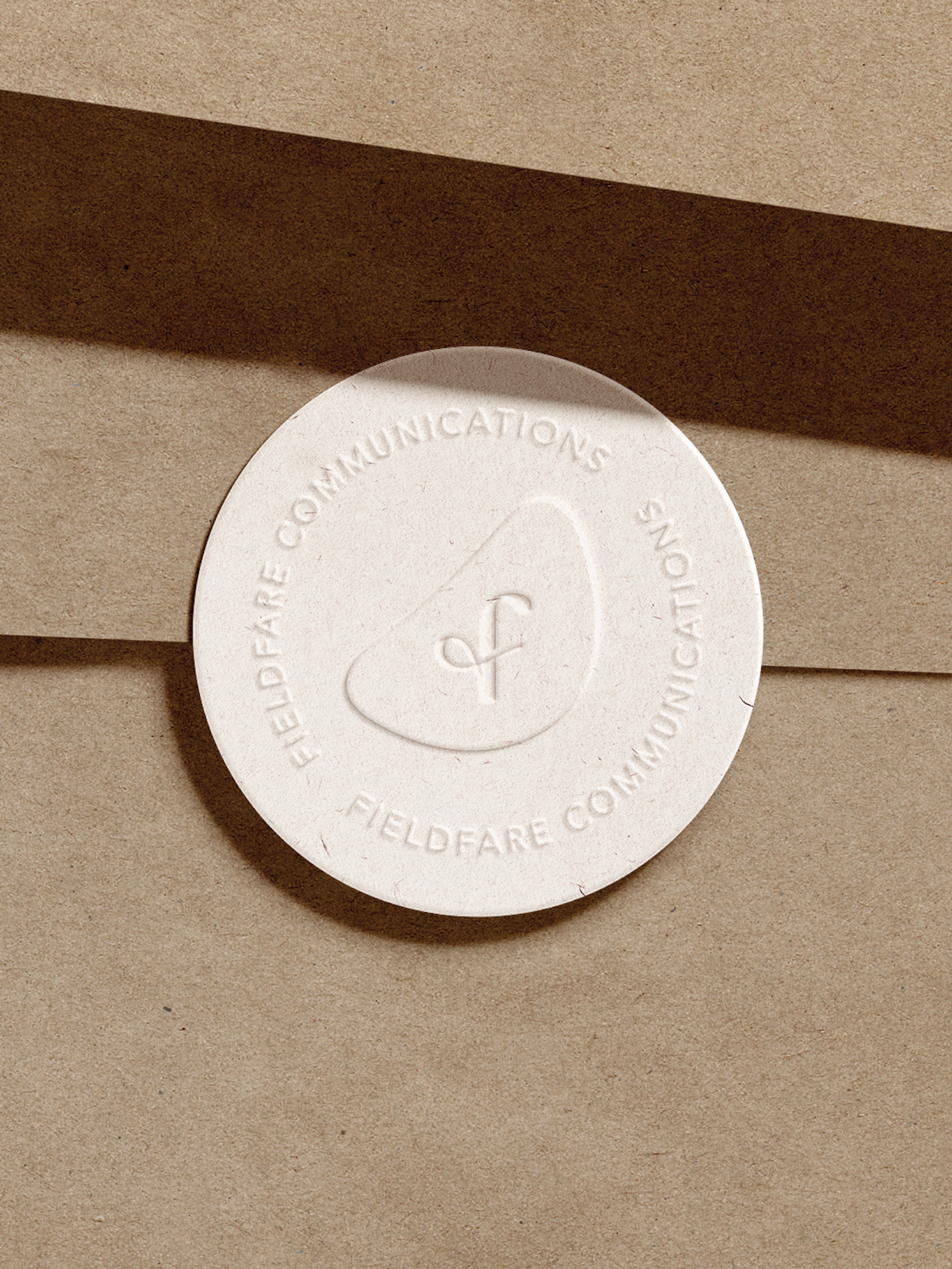
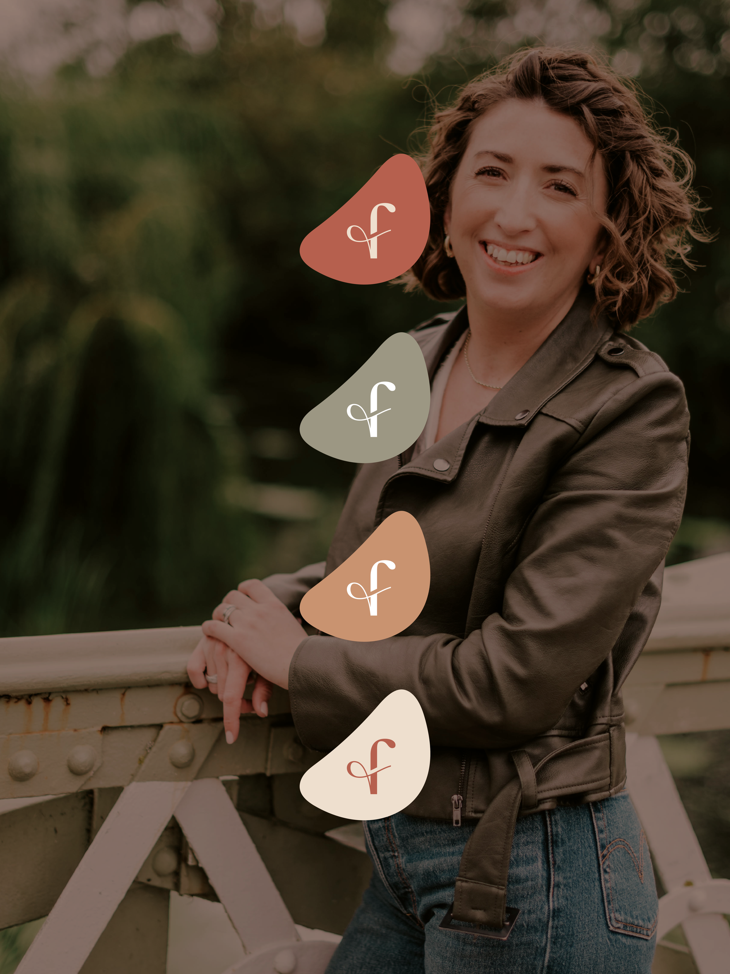
The organic shape used across the brand comes from the curve of the fieldfare's breast. It holds the f submark, frames imagery, crops into layouts and makes soft blocks of colour. Terracotta is the hero, supported by stone, cream and sand, with muted olive and mist accents.

What Emma got:
A full logo suite: primary and stacked wordmarks, circular marks, submarks and the standalone f
Print and digital logo files
A brand style sheet explaining what each file is for, because handing over a folder of mysterious file types and wishing you luck isn't really our style
Putting it to work
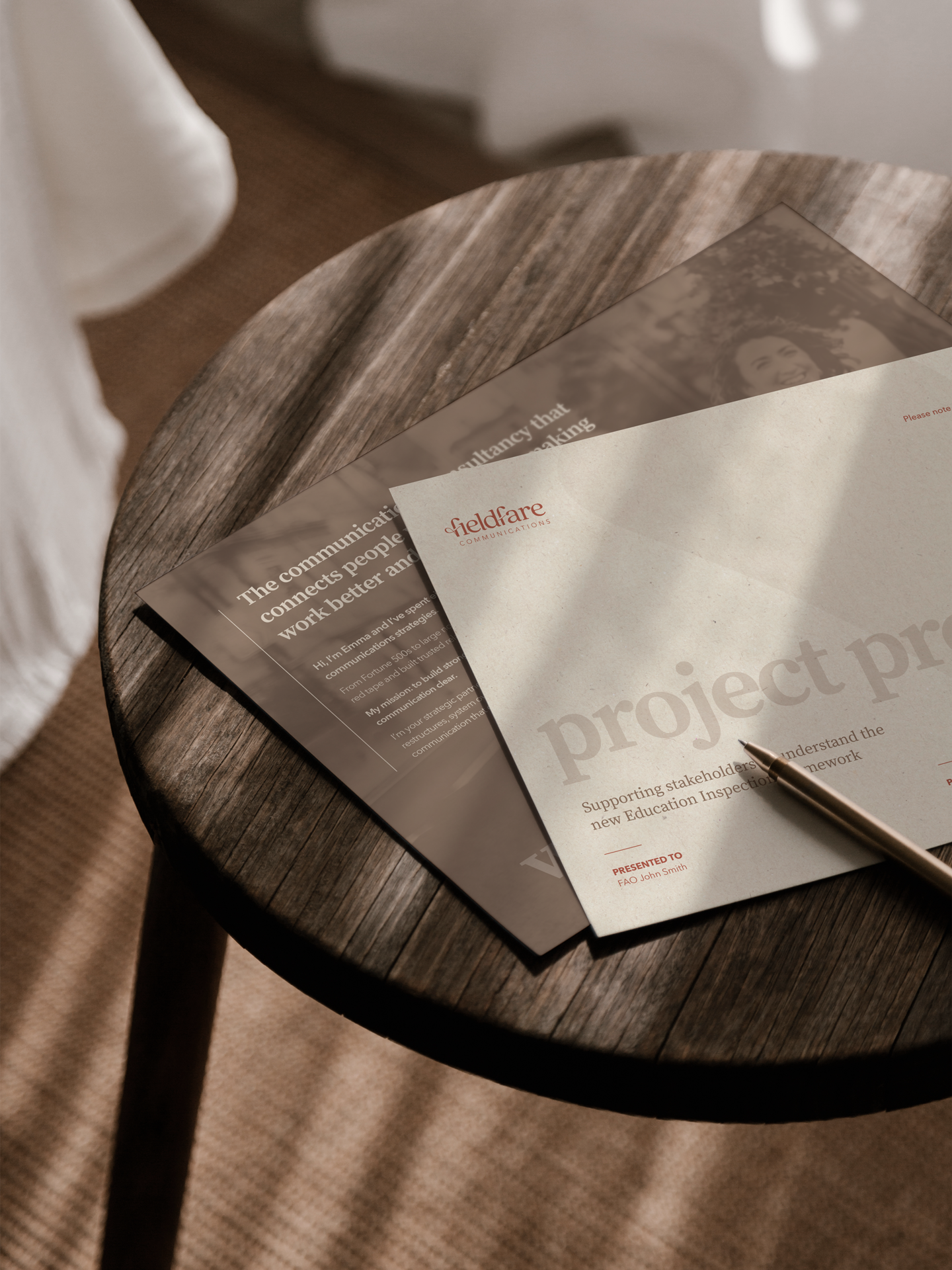
Since launch, Emma has come back to put the identity to use. We built her a bespoke project proposal template in Canva that she can edit herself when pitching. It carries the typography, colours, shapes and the f through into something she uses day to day.
In Emma's words …
"Sara was my first port of call when I decided to set up my own business, and she absolutely nailed the brief. I loved the process she took me through. She encouraged me to think deeply about how I was positioning myself, what my values are, and who I really wanted to work with.
She took the vague, sketchy outline in my head and brought it to life, creating a brand that truly reflects what I want my business to be."

BRAND IDENTITY DESIGN
CREATIVE DIRECTION
GRAPHIC DESIGN
Starting something new?
You don't need to know what your logo should look like. That's our part. If you're starting a business or you've outgrown your current identity, we can help you find the thread and build a brand around it.